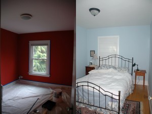
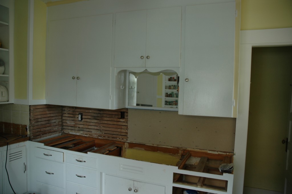
Like taste (famously described by Proust), photographs bring with them their chains of association. Even after years, seeing photos of the house before we repainted still elicits a little cry of shocked disgust and reminds me the listing for the house touted “designer colors.” Taste is, of course, personal, but I can’t imagine hot salmon a soothing color for a bedroom. Or what designer might actually choose it. The color featured prominently in the house when we moved in, and we spent several weeks eradicating it. A couple of coats of primer and a couple of coats of paint later, and we had the relaxing blue we desired in a bedroom even if the electric salmon still haunts our memories. Color, and consequently paint, has a power. It can inspire, calm, excite, depress, or chosen especially badly, terrify. Use it wisely.
Tag Archives: 2007
Kitchen–Cabinet Doors
I was hanging the second of my newly built kitchen cabinet doors, a simple frame-and-panel, paring a hinge mortise when I realized the full weight of the task in front of me. One door hung, one more that would be hung . . . eventually. I shaved off another paper thin layer of wood, then looked up and counted the number of doors that needed to be hung. Only fourteen more to go. I swore quietly to myself and checked the fit of the hinge in its mortise. Continue reading
Kitchen–counters and backsplash
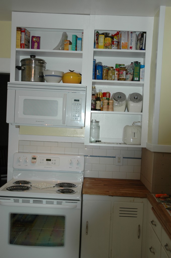
Our intention to leave the kitchen remodel for a later date didn’t last much beyond the death of the expiring range a couple of months after we moved in. We bought a new stove and matching OTR microwave. Since there was no cabinet over the wall, I built a couple of plywood boxes and applied a face frame. With the cabinet (the door would wait for a while) and appliances installed, the kitchen looked even more depressing. Fresh paint could go a long way towards lightening the space, but there was still the beige backsplash. And the counters.
We contemplated a staggering array of yellows and the best accent stripe color for the new white subway tile backsplash. I wanted to do soapstone counters since soapstone can be worked with woodworking tools, but the lead time and cost suggested another alternative, one we found in Bungalow Kitchens. Wood counters are period appropriate, and IKEA offers different species at reasonable rates.
With materials and colors selected, we demoed the old backsplash and underlying plaster, installed concrete backerboard, installed the new backsplash using a budget wet saw, removed the old counters, installed new counters, sink, and garbage disposal and painted over the course of a couple of weekends.
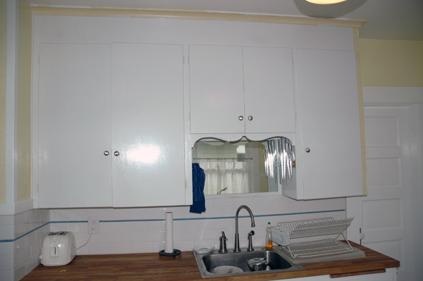
New counters, sink, and backsplash. The cabinets still need new doors, and the curlicue trim above the sink must go.
Kitchen–Before
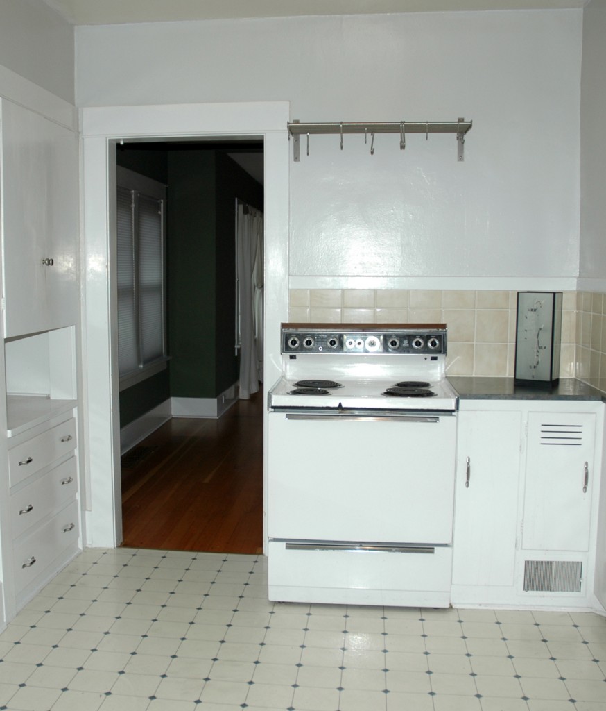
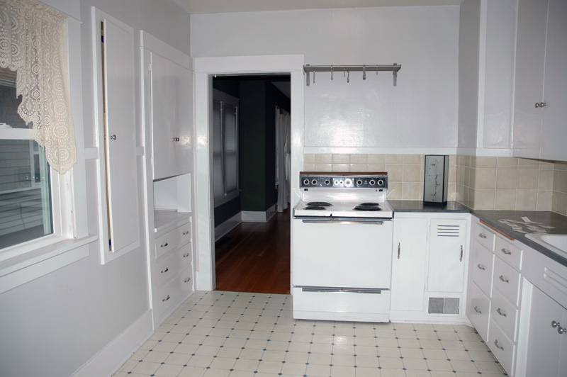
House listings share with résumés an attempt to put the best light on the subject, and when writing either, it is easy to slip from positive spin to exaggeration, and to outright lying. The listing for our house claimed a recently updated kitchen, but “recently updated” here turned out to be some newish paint, a sheet vinyl floor less than a decade old, and new knobs on the cabinet doors. About the only thing that could be said for the kitchen when we first looked at the house in 2007 was that it didn’t feature cherry cabinets, granite counters, and stainless steel appliances. That particular look palled quickly as we scanned listing after listing and saw that 95% of all updated kitchens featured cherry and granite. By comparison, the gray walls, laminate countertops, and out-of-scale beige wall tiles were less than inspiring, certainly, but not a deal breaker. We could live with it for a time while we tackled more urgent projects–painting over the garish, glaring “designer colors” elsewhere in the house. And at least we wouldn’t have to feel bad about replacing a new kitchen.
Kitchen Inspiration
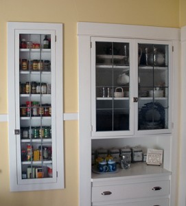
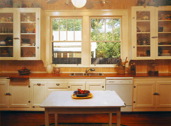
Sorting some unfiled photos and found the following from Bungalow Kitchens. It was one of the primary inputs as we considered options for updating our neglected kitchen. We especially liked the painted cabinets, nickel hardware, use of glass in the upper cabinet doors, and the wooden counter top. The cabinet latches are unduly bulky, though, and we prefer inset hinges to the surface mounted ones used here.

