I was hanging the second of my newly built kitchen cabinet doors, a simple frame-and-panel, paring a hinge mortise when I realized the full weight of the task in front of me. One door hung, one more that would be hung . . . eventually. I shaved off another paper thin layer of wood, then looked up and counted the number of doors that needed to be hung. Only fourteen more to go. I swore quietly to myself and checked the fit of the hinge in its mortise. Continue reading
Tag Archives: 2008
Build a Leaded Glass Panel

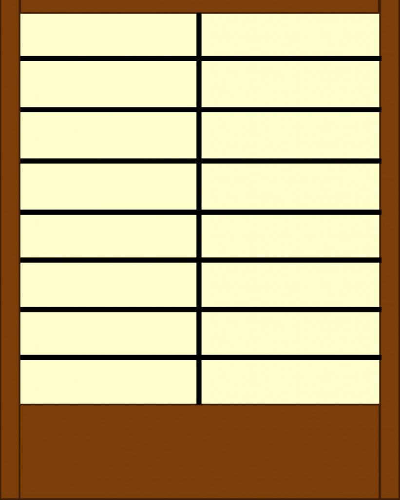
Straight cuts allow for plenty of design variation while allowing for easy construction. Here the choice of frame, color of glass, and thickness of came combine to suggest a shoji screen.
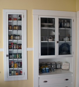
On the local Historical Society’s annual tour of homes, we admired the leaded glass paneled doors of a kitchen’s cabinets and decided to do something similar as part of the update to our kitchen. While
cutting and fitting curved pieces requires special equipment, the straight edges used here are easily assembled using only a few additions to common shop tools. Simple variations adapt the panels to a variety of styles, including Craftsman, Prairie, and Asian-inspired.
To build your own panels, you’ll need a glass cutter, straight edge, solder, came, a way to cut the came (I used a power miter saw, but a hacksaw will work), glass, putty, putty knife, and an assembly board, a large rectangle of MDF or plywood with two fences forming a right angle at one corner of the board. The panel is assembled from that corner outward, ensuring tight fitting joints and a square panel as glass and came are added to achieve the desired size. The panel is then soldered and puttied. Read more.
Kitchen–Before
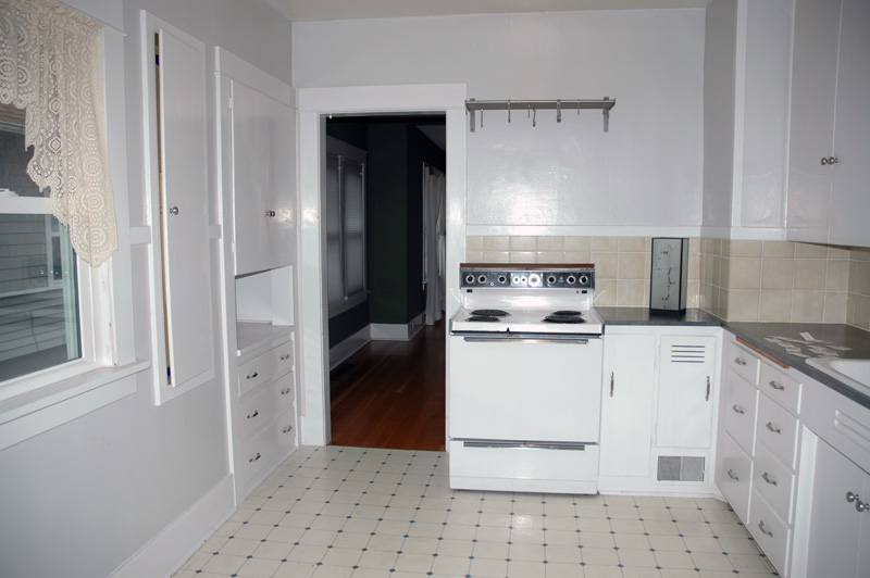
House listings share with résumés an attempt to put the best light on the subject, and when writing either, it is easy to slip from positive spin to exaggeration, and to outright lying. The listing for our house claimed a recently updated kitchen, but “recently updated” here turned out to be some newish paint, a sheet vinyl floor less than a decade old, and new knobs on the cabinet doors. About the only thing that could be said for the kitchen when we first looked at the house in 2007 was that it didn’t feature cherry cabinets, granite counters, and stainless steel appliances. That particular look palled quickly as we scanned listing after listing and saw that 95% of all updated kitchens featured cherry and granite. By comparison, the gray walls, laminate countertops, and out-of-scale beige wall tiles were less than inspiring, certainly, but not a deal breaker. We could live with it for a time while we tackled more urgent projects–painting over the garish, glaring “designer colors” elsewhere in the house. And at least we wouldn’t have to feel bad about replacing a new kitchen.
Kitchen Inspiration
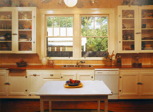
Sorting some unfiled photos and found the following from Bungalow Kitchens. It was one of the primary inputs as we considered options for updating our neglected kitchen. We especially liked the painted cabinets, nickel hardware, use of glass in the upper cabinet doors, and the wooden counter top. The cabinet latches are unduly bulky, though, and we prefer inset hinges to the surface mounted ones used here.


