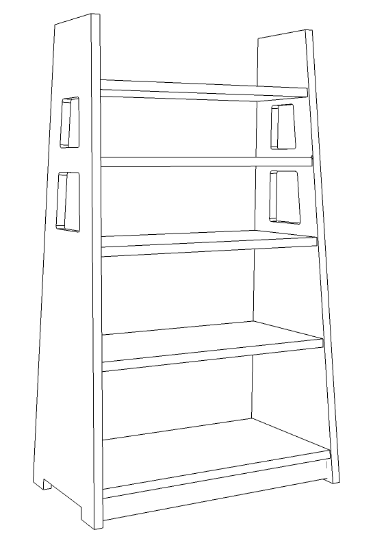
The cutouts and sloping sides of Limbert’s No. 346 Magazine stand distinguish it from more pedestrian offerings from other makers.

The cutouts and sloping sides of Limbert’s No. 346 Magazine stand distinguish it from more pedestrian offerings from other makers.
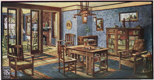
An illustration from one of Limbert’s booklets showing a library furnished with pieces by the company.
Limbert is often dismissed as a copyist of more capable designers, but at his best, he was a capable synthesist, combining diverse elements from European, American, and Japanese design into striking (and sometimes strikingly modern) forms. The sources for his inspiration are wide ranging. His earliest Arts and Craft line shows a debt to the architect Charles Voysey, Dutch folk forms, and Art Nouveau. The later line shows Limbert’s familiarity with the Craftsman furniture produced by Gustav Stickley, the Prairie Style of Frank Lloyd Wright, and the work of Charles Rennie Mackintosh and the Vienna Secessionists. The exposed joinery, rectilinear forms and visual mass of this furniture would not be out of place in the offerings of the many manufacturers responding to the increasing popularity of Craftsman furniture. Some of these designs match or exceed Stickley’s. Continue reading
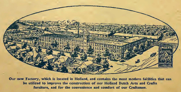
A drawing of the Holland factory from one of the company’s booklets.
After years as a traveling salesman of furniture and a failed manufacturing partnership, Limbert founded the Charles P. Limbert furniture company in 1894 and spent the rest of the decade building it. By the turn of the century, his reputation as a furniture salesman was well established–the April 1901 Furniture Record called him the “furniture commission man.” That skill earned him several prominent contracts, including the Patlind Hotel in Grand Rapids, the Grand Canyon Hotel, the Mission Inn (Riverside, CA), and the Old Faithful Inn in Yellowstone National Park. Continue reading
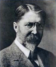
Charles Limbert (1854-1923) was as interested in the business of selling furniture as in advancing the ideals of the Arts & Crafts movement.
Limbert was born in Logansville, Pennsylvania, and grew up in Akron, Ohio. After a brief detour in the carriage trade, he followed his father into furniture sales. He began as a traveling salesman, working for different companies in the Midwest including Monk & Roberts and the John A. Colby Company. During this period, he met Philip Klingman, another salesman. The two agreed to represent each other’s wares, reducing the size of their territories. The agreement marks the beginning of an extended partnership and shows Limbert’s willingness to experiment with how he did business. Continue reading

Hot off the presses–my new book on the Arts and Crafts furniture of Charles Limbert.
To celebrate the release of my new book (available on Amazon), I’m declaring September Charles Limbert month, featuring posts here and at popularwoodworking.com dedicated to the life and work Limbert.
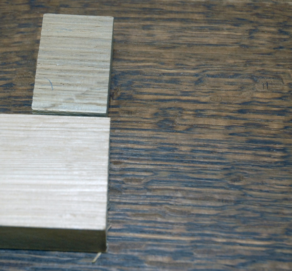
Clockwise, beginning with the small offcut: fumed oak, fumed oak and boiled linseed oil, and unfinished.
Flatsawn–cut so that the tree’s annular rings run parallel to face of the board–white oak is less than distinguished, featuring a porous grain and and a course figure. Take the same log and quarter saw, or slice it so the annular rings rung perpendicular to the board’s face, the wood takes on a whole new character, showing a vertical grain overlayed with the flecked pattern of the tree’s medullary rays. And fuming the wood–exposing it to the fumes of ammonia–creates a chemical change in the wood as the ammonia reacts with tannic in the heartwood to darken it. A top coat of finish completes the effect, leaving the wood a rich, warm brown. Continue reading

The Met’s Gallery 743 features this desk chair designed by Charles Rohlfs and his wife, the novelist Anna Katharine Green.
Charles Rohlfs occupies a curious place in the Arts and Crafts movement. Although they share many elements of furniture by contemporary makers–material choice, finish, visual mass–his designs oftentimes seem to anticpate Art Noveau or recall the Victorian tradition of ornament, especially in their use of elaborate carvings. He came to furniture design late, first working as a stove designer and actor before setting up shop in Buffalo, New York in 1897. The 1901 Pan-American Exposition established his reputation as a designer, and he would go on to participate in the 1902 International Exposition of Decorative Art in Turin and become a member of the British Royal Society of Arts. Despite this success, he retired from furniture making and became active in Buffalo politics.
A single piece represents his work in the Metropolitan Museum of Art’s holdings, a desk chair he designed in collaboration with his wife, the crime novelist Anna Katharine Green. Balancing the slab construction and dark finish are a slender silhouette and signature Rohlfs fretwork (here inspired by the cellular structure of oak), making for an odd, almost ethereal interpretation of the Arts and Crafts aesthetic.

Electric salmon was a little too shocking for our taste, so we primed, primed again, and painted.
Like taste (famously described by Proust), photographs bring with them their chains of association. Even after years, seeing photos of the house before we repainted still elicits a little cry of shocked disgust and reminds me the listing for the house touted “designer colors.” Taste is, of course, personal, but I can’t imagine hot salmon a soothing color for a bedroom. Or what designer might actually choose it. The color featured prominently in the house when we moved in, and we spent several weeks eradicating it. A couple of coats of primer and a couple of coats of paint later, and we had the relaxing blue we desired in a bedroom even if the electric salmon still haunts our memories. Color, and consequently paint, has a power. It can inspire, calm, excite, depress, or chosen especially badly, terrify. Use it wisely.

A Stickley side table in quartersawn white oak.
Side tables are a useful form, and this Gustav Stickley design is a fine example, its size and shape letting it serve in a variety of locations. Construction is straightforward: half-lap joints join the aprons; the bottom stretchers join the legs with through tenons; and the top stretchers are dovetailed to the legs. I fumed the table with ammonia to darken the oak, then wiped on a couple of coats of boiled linseed oil.

A butterfly key binds a split in a slab table by George Nakashima.
Unlike other makers represented in the Metropolitan Museum’s collection, the work of George Nakashima is not on display in a gallery. Instead, it furnishes the entry room to the museum’s Japanese galleries. Consequently you can sit at a large conference table in a sculpted chair and run your hands over the glassy smoothness of the slab top or inspect the inlaid butterfly keys. Continue reading